A product demo hub, answered as a brief
Creative Director Role Simulation
Creative Director who builds the team and the AI system behind it.
contact@manidastgerdi.com

Six working prototypes inside
Section 2 is not only described. You can click through it.
Each prototype sits right under the idea it proves, and each one opens full screen. They also adapt to the visitor: pick a role once, and every screen after it speaks to that team.
They show the direction, not the finished product. The fine detail and the craft decisions belong to the real build.
This plan is based on the AI systems available as of October 2026. The field moves fast, so the setup can change quickly.
Before We Start
I am Mani Dastgerdi, a Creative Director and narrative architect in the B2B and SaaS space.
What I do has one principle: From Noise to Message. B2B brands usually do not have a problem with a lack of information, they have a problem of excess. My job is finding that one message that needs to stay, and removing the rest.
For this task, I went and became a user first. I experienced the platform’s Interactive Platform Tour completely on desktop and mobile. Then I went to real buyer reviews. And finally, I looked at the brand's position compared to competitors.
Creative Plan and Budget 2027
Creative Vision for 2027
When you face each part of the platform, they each do their job correctly. CDP collects data, Architect builds the customer journey, the AI agent makes decisions. Technically, none of them have a flaw.
Yet none of this gives me the feeling of a soul, of something that truly exists. It carries no behavior of its own, no personality of its own. What is missing here is not a software identity. That part already exists. What is missing is a brand identity. In the mind of the user, it never becomes more than a piece of software; it never crosses into being believed as something alive.
This shows most clearly when you experience these back to back: what you feel is moving from one tool to another, not facing a single entity that knows you and knows itself. This is seen in the product demo itself: each part has its own tone and rhythm, as if several separate teams built their own piece and then glued them together.
This is not a place where a new feature fixes anything. The capabilities don't have a problem; the problem is at the connection point between them, exactly where they should meet and don't.
What is really missing is a place where these capabilities are no longer counted one by one and turn into a unified feeling. Brands that truly stay in the mind are rarely remembered for their feature list. They are remembered for the feeling you get when you face them. This feeling does not come from capability. It comes from coherence.
Wherever it appears, it is the same thing: the same calmness, the same precision, the same pause that comes exactly in its place and not a moment earlier or later. Its color is not random. Any color chosen comes from a specific feeling, not from a graphic rule. Its form is the same: an angle that repeats, a distance that is always the same size, not because a guideline asked for it, but because that same repetition tells you, without you noticing, that this is the same thing you had seen before.
And when this harmony is precise enough that it never slips, something happens that no explanation can build. It can only be allowed to happen: you no longer feel you are dealing with a page or a piece of software. You feel you are dealing with something that is actually there, something you can count on, because the more time you spend with it, the more you see it knows you. And something that knows your need so precisely, automatically settles in your mind as wise and reliable, without anyone needing to say it.
This presence is not built once and then left alone. It must be repeated in every touchpoint where someone faces this brand, until a logo is no longer even needed to recognize it.
One of the behaviors of this presence is exactly what buyers are missing right now:
The complaint is: "I don't know where I am in my path, who is responsible, and when it finishes." And I felt exactly this in the first 90 seconds of the tour too, the same ambiguity on a smaller scale.
A unified and aware presence naturally solves this, because something that continuously knows you cannot abandon you. This clarity is not a separate claim; it is the natural behavior of the same thing I described above. We don't promise speed, we promise clarity. Three months with a map is a completely different experience than three months in confusion. So in one line: this work should become known for feeling like one coherent, aware thing, not for a list of capabilities. The implementation duration is not in our hands; but a person always knowing where they stand, is.
What exists at the end of 2027 that is not here today
- One. the platform’s work is recognizable even without a logo. Today if you remove the logo from any output, it could belong to any other company in this category. This must end.
- Two. The brand is known for one thing, not for a feature list. Today the message is "we have everything". This message says nothing in a category where everyone says the same thing.
- Three. The work is seen in places where it has no presence today. Design reviews, award lists, industry talk. Unlike product capabilities, they cannot be bought; they must be built.
And how this connects to growth and IPO
What is not visible from the outside is how much an American buyer actually knows each of these two brands. That number is not obtained by search, it is obtained by custom market research from target buyers. And the fact that such a number does not exist today is itself one of the first jobs of the year, because without it, it can never be proven whether the brand's work had an impact or not.
But the outside view alone already shows one thing: outside the company, the platform does not have a narrative that arrives before the sales team. Everything the buyer knows about this brand comes from the sales team itself.
And right here it connects to growth and IPO. When the brand does no work of its own, the entire burden of growth falls on the shoulders of sales. For a 50 percent growth target, it means you have to spend more people and hours for each unit of growth. And the cost of that growth shows up in the valuation. the platform has its product. What it lacks is recognition. And this is the only part of the equation that is the creative team's job.
Three things that are a priority for me in building this identity
Today's visual language relies on empty space, but its elements are not defined. Minimalism is not a problem; minimalism without elements is a problem. My job is building simple but conceptual elements.
The buyer must feel they themselves are smart, not that we are smart. First they must feel calm. We need sales, not showing off.
The biggest weakness I saw was the lack of narrative. It is as if narrative were seen as incompatible with a B2B SaaS identity. I think exactly the opposite.
Whatever identity gets built for this brand, it has to pass three tests. If it needs an explanation before people understand it, it does not work. If its metaphor is borrowed from another industry, it ends up advertising that industry instead of this one. And if it shows AI as nothing more than a tool, it becomes indistinguishable from every competitor saying the same thing.
The final direction has to pass these three tests, and it has to be built jointly with the brand team, not delivered by one person from the outside. In the meeting, I will gladly open up my thought path and the options I reviewed and rejected.
How I Deal With Challenges
Before going to each priority one by one, I must say that these five are not five separate tasks. They are one chain, and each one closes a gap the others leave open. This chain is exactly what makes that unified presence possible at the scale of 28 countries. Without it, the work falls back into separate, uncoordinated pieces.
How a request moves
The Briefing to Rule-Correction Chain
Request and brief
Deadline, explanation, idea. No brief, no request.
AI detection layer
Is it creative, or business as usual?
Two paths
Quality filter
Four questions: message, identity, job, industry.
Why this order is important: if you build the design system first but the brief is still messy, the system just produces the wrong thing faster. First you must clean the input.
Priority 1: Updating and scaling Design System
Today every piece that gets published needs its own design work. Every new demo and regional request sits directly on the design team's desk. With 7 languages and 28 countries, this model fails. I suggest the design system comes out of manual mode and becomes a central AI-based system (like Claude Design). The outputs are reviewed periodically and results return to the same center every week to improve rules. Any error seen once must be stopped at the rule level next time, not the person level. AI tools change fast, so the exact setup is chosen at the moment of execution: the most practical and fastest option available then. That may well be a purpose-built agent for this job.
Priority 2: Hiring and developing skills
I still don't know what exactly each team member does. Three internal and three open positions, but actual skill mix is not clear from outside. So my order of work is: first, an audit (reviewing the actual output of recent weeks). Then, freeing time from repetitive tasks with tools. The goal is not productivity, it is bringing back motivation. Then, hiring for the 3 open positions based on the real need the audit shows.
I did exactly this before, in an agency in Istanbul. I inherited a team of eight people who had been hired in bulk with no real structure. After about two months I became the team lead. Working together with management, I kept the people who had real talent and motivation, and matched tasks to real strengths instead of assumptions. That eight-person team ended up producing output at a level well beyond its size.
The day a new manager says "AI enters the design system", the first thought of every team member is "so what happens to me?". This must be answered face to face in week one. If we tell the customer outside that AI enhances you, not replaces you, but inside our own team we use AI as a skill replacement, the team feels this contradiction. A tool does not replace skill, it multiplies its capacity.
Priority 3: Reliable external partner network
My personal experience as a freelancer is directly relevant here. What makes an external partner fit in quickly and without friction is 3 things: clean brief from start, brandbook access instead of guessing style, and one specific person to ask questions. Proposed structure: selecting from vetting platforms, a small paid test, and adding the successful ones to a standing partner pool.
Priorities 4 & 5: Automating and Peer Review
The briefing system with AI detection sends BAU to the design system and creative work to the team. This solves the buyer's problem exactly: "no one could give a definitive plan". For output quality, instead of subjective checklists, I ask 4 specific questions to consider work ready:
- Message: If the audience only sees this piece, what exactly do they understand?
- Identity: If we remove the logo, is it still recognizable?
- Job: What does this piece do for the audience? Where does it move their decision path?
- Industry: Can a competitor publish exactly this without changing anything?
Automation also reaches the video layer
The same logic applies to video. Every demo video that ships creates hidden work: a vertical cut for mobile, a square cut for social, shorter versions, naming, exporting, and delivering every version each region needs. None of it needs creative judgment, yet it eats the hours the video team needs for storyboarding and new work.
This layer is one I design and run myself. Designing AI agent systems like this is part of my daily work, not a plan on paper. The agents work inside the editing software itself: clips are cut, retimed, named and exported in every format a campaign needs, while the creative decisions stay with people.
On a weekly show currently in production, this system cut short-form production per episode from 3 days to 4 hours, with no drop in quality.
From one master video to every format
Made by the team
Agents inside the editing software
For the platform, this answers two findings in this document directly: demo videos that are all 16:9 and break on mobile, and the video skills gap in the team. It follows the same order as everything else: a short audit of the current video workflow first, then automation of the one or two tasks that cost the team the most time.
First Year Priorities and Parallel Paths
The tension I must solve openly: the current system does not stop for a single day. Daily requests from 28 countries still come. The solution is delegating roles, not dividing time. The current system continues under the Senior Designer, with real authority. I stay involved in the quality level. I say this from real experience. In two previous roles, I saw that when real ownership is not given away, everything lines up behind one person and quality goes down. I am not repeating that mistake here.
Building these systems is not possible without a dedicated resource. Either one person from the tech team is given to this project full-time, or internal audit shows someone in current team has AI skills at this level. If neither is possible, the scope becomes smaller. I will not promise the same volume on an optimistic timeline.
Year one
Three Parallel Paths of Year One
All three run at the same time. Only the middle one moves in steps.
Maintenance
Keeps running
Building systems
One after another
Identity
Parallel from day one
Why the public launch waits
If we announce today this unified presence is here, the promise falls apart the moment someone sees contradicting evidence. The evidence against it today:
- Error on mobile: "This demo has not been configured for mobile yet"
- Filter dead-ends where I reached "No items found" in 4-5 attempts
- Email form before showing any value on mobile
- Absence of a main tour video, which is the most important sales aid
The building work proceeds from day one. The only thing staying behind the gate is the external announcement, held until this evidence is addressed.
Budget Framework
The allocation logic in the two halves of the year is completely different. The biggest budget risk of the year is spending campaign money before the identity is ready.
First Half: Building Capacity
- Team and HiringLargest share of the first half, sized after the audit.
- Systems and ToolsOne-time investment. I build the core myself (no agency fee).
- Partner NetworkSetup, small paid tests, and emergency capacity.
- Production and CampaignLimited. Only existing commitments and direction tests.
Second Half: Spending Behind Identity
- Production and CampaignLargest share of the year. Launch campaign, video, event.
- Partner NetworkHighest point of the year, to support campaign production.
- Team and HiringFixed, because the team is complete by then.
- Systems and ToolsOnly maintenance and development.
How I Measure Success
The success of these programs is measured in two phases with different natures:
Metrics must leave no room for interpretation:
- Zero device errors in main paths
- Zero filter dead-ends in Product Demo Hub
- 100% response rate to reviews under 4 stars
- Ratio of team time on creative work vs BAU before and after system
- Design cost and time per BAU output
- Hours from one master video to every delivery format
The first two are not connected to the creative direction team and are not its job to fix. But they need to be named here, because a broken device path or a dead-end filter is what a real buyer sees first, and it damages brand credibility before any creative work has a chance to change that impression. 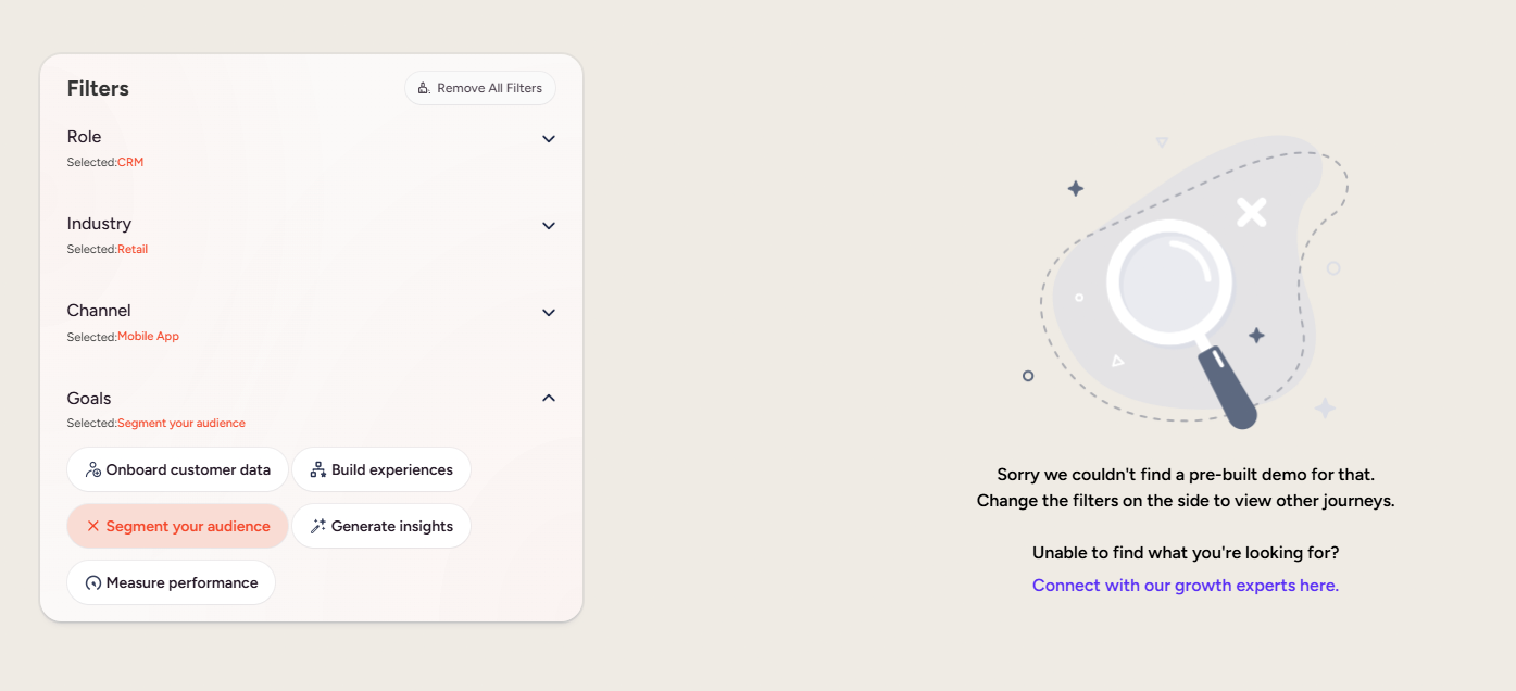
Metrics based on the three vision promises:
- Recognition without logo: Measured by random sampling of outputs.
- Unified recognition: Checking market language in reviews, media coverage, and competitors' descriptions of us.
- Presence in new spaces: Independent design media coverage, award lists, and campaign reach.
Every quarter, two data sources are put together: raw external evidence and internal team prioritization based on their daily operational knowledge. Common items between these two become priority one. This itself is the continuous peer review.
Product Demo Hub Redesign
Why this Hub matters, and what is broken today
This Hub is the first place someone faces that unified presence I described in Section 1. If the first encounter is uncoordinated, nothing after it can compensate.
And that same ambiguity I talked about regarding the three-month implementation in Section 1 is seen exactly in the first 90 seconds of this tour too: I don't know where I am in my tour, what the previous step was, what the next is. These two are not two problems. They are a single pattern in two scales.
Current Audit Summary (Points of Failure)
- Entry and rhythm: The automatic tour drops the user in a mass of text without a big picture forming in their mind. By the middle of the tour, I was mentally overloaded.
- Control and cognitive load: Cannot go back, stop, or skip. The timeline bar only shows time passed, not position.
- Empty AI page: The user is left with an empty AI page. In an era where buyers expect AI to have already understood their data (like how they experience Gemini, Notion AI, or Gamma daily), a blank canvas implies the capability is just a claim. It must prove it knows me.
- Visual language: Minimalism without elements. Video formats are old. Thumbnails convey 50% of the feeling at best. Music is messy and dry. And the assistant needs a stronger identity (even a simple icon).
- Filter dead-ends: Left without structure. More seriously, in four or five attempts combining fields, I hit a "No items found" error. The user should never reach a dead-end.
- Mobile disaster: Mandatory email form before showing value. Irrelevant promo popup interrupting the flow . And when clicking the tour: This demo has not been configured for mobile yet. This directly violates the brief's goal. Videos are all 16:9 and not optimized.
Behavioral Pattern and Vision
I saw three separate things that have one root: campaign pop-up in middle of tour, email form before showing any value, and a tour that introduces instead of making you understand. In all three, the platform put its own interests before the user's calm and goal.
The principle for the whole redesign
Experience-first, not lead-first.
First show value. Then ask who they are.
This is the information architecture behind the redesign: instead of forcing one path, we put a simple choice at entry.
One element repeats on every screen: a small living shape in the platform’s own orange. It always sits where the visitor is right now. On the entry it marks the start, in the film it sits on the current chapter, in the tour it marks the current step, and in the AI builder it becomes the assistant. This is the unified presence from Section 1, made visible. It is how the Hub stays recognizable without a logo.
Personalization is the thread
The Hub remembers who you are.
Pick a role once, and everything after it adapts. The film retells the story from your seat. The library opens on your demos. The tour names you as the owner of your steps. the assistant starts from what teams like yours need.
The role is never a cage. A "Viewing as" tab sits at the top of every screen, so a CMO can switch to CRM and see the same feature from the side of the team that will run it. This is the presence that knows you, from Section 1, in practice.
Motion also answers "what happens next" before the click. Hover or focus on any choice, and a short motion shows what it opens: the WhatsApp message a demo sends, the step that comes after this one, the journey the assistant is about to build. The text explains why, the motion shows what.
A 90-second film that tells the visitor's own story through one shopper, Maya. It first asks who is watching. Then each chapter names a problem that team lives with, and shows the part of the platform that solves it. No menus, no decisions after that first one.
The visitor builds a real journey inside the product, one click at a time, with Back and Skip at every step and a real position indicator.
On mobile, Path A becomes the default, because the interactive experience is completely broken there right now. Video should be vertical or square, not a cropped 16:9. The email form is removed from the start of the path and only shows after value is shown, if it is needed at all.
Path B: the guided tour
Always clear: where you are, who owns this step, what comes next
Visitors often leave without finding the one demo that would have sold them. So the page asks one question first: what is your role. Every choice shows how many demos are behind it, and a choice that leads to nothing cannot be picked. Industry, channel and goal wait behind More filters, for the people who want them. When a search finds nothing, it offers demos that do exist instead of an empty page.
Thumbnails stay grey and still until you point at one. The grid stays calm, and the demo you are looking at comes alive. Every thumbnail follows one template, so the library reads as one product, not 80 separate files.
Instead of a blank page, the assistant asks one question at a time and builds a starting point the buyer can see right away. the assistant also gets an identity: the same living shape that marks where you are everywhere else in the Hub, plus one bright point of light, a quiet nod to its name. When the assistant thinks, the light circles the shape. It pauses before it answers, and it asks who you are before it suggests anything.
Redesign Principles, Scalability, and Success Metrics
Scalability: Section 2 is the practical proof of Section 1.The brief asked that monthly demo publishing should not create a design burden. If each of the 80 demos has to be designed by hand, it contradicts the claim of the first section. Modular templates and intro motions are built in the central Design System so publishing this Hub is self-service. This is the only way that unified presence expands across 7 languages and 28 countries without breaking.
- ■ Step-by-step display: Information in hierarchy order, not dumping.
- ■ No dead-ends: Incompatible filters must be disabled before selection.
- ■ Conceptual element: Simplicity is from having meaningful elements, not just removing.
- ■ Transition, not jump: Every state change must show its path.
- ■ Copy discipline: Short sentences, one idea per screen. Text explains why, motion shows what.
- ■ Base health: Zero device errors, zero filter dead-ends, 100% identical format.
- ■ User behavior: Tour completion rate, time to find relevant demo, ratio of Path A to B.
- ■ Business impact: Hub to demo request conversion rate, and reducing design cost/time of each new demo (via modularity).